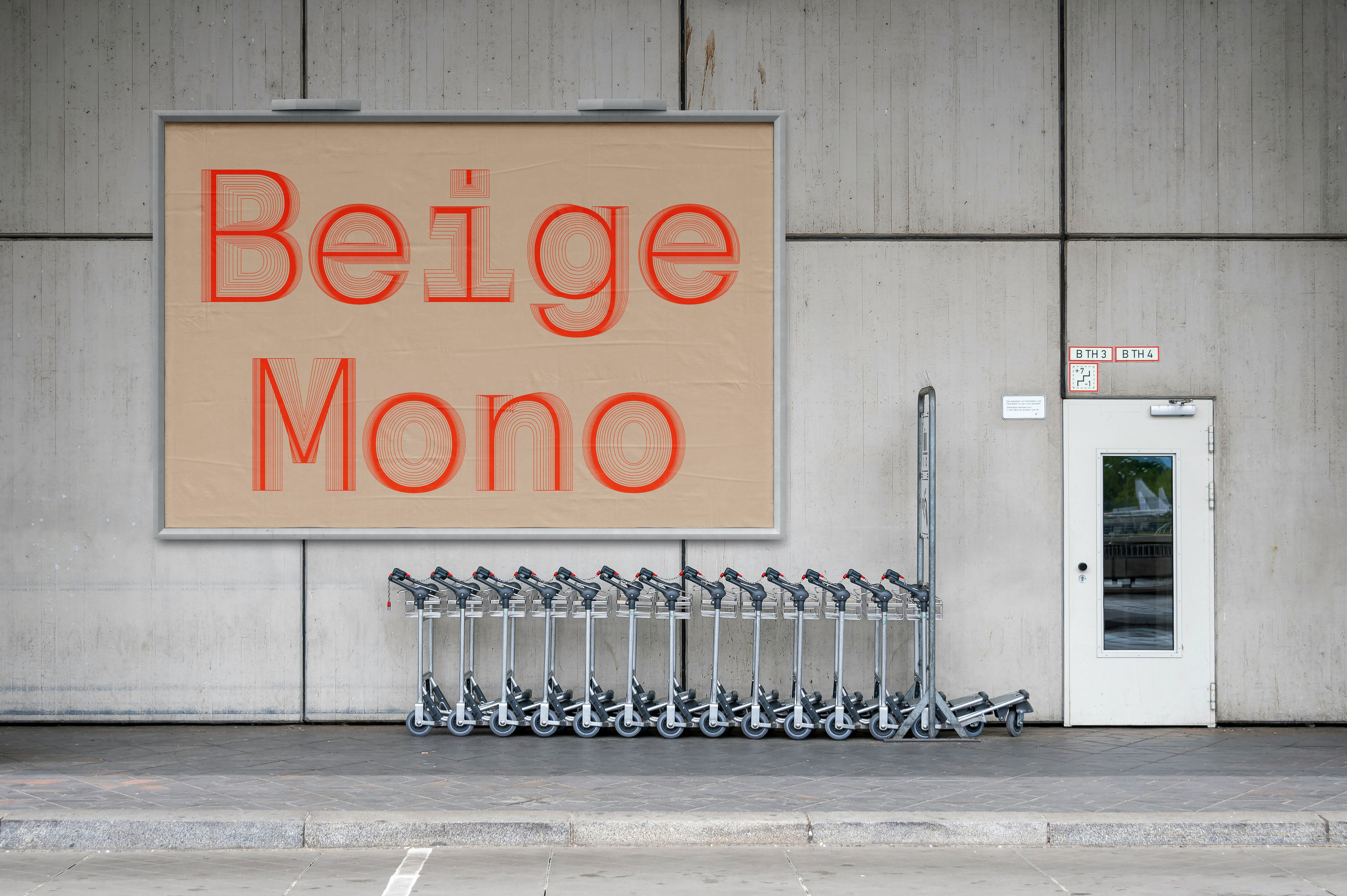
Beige
About
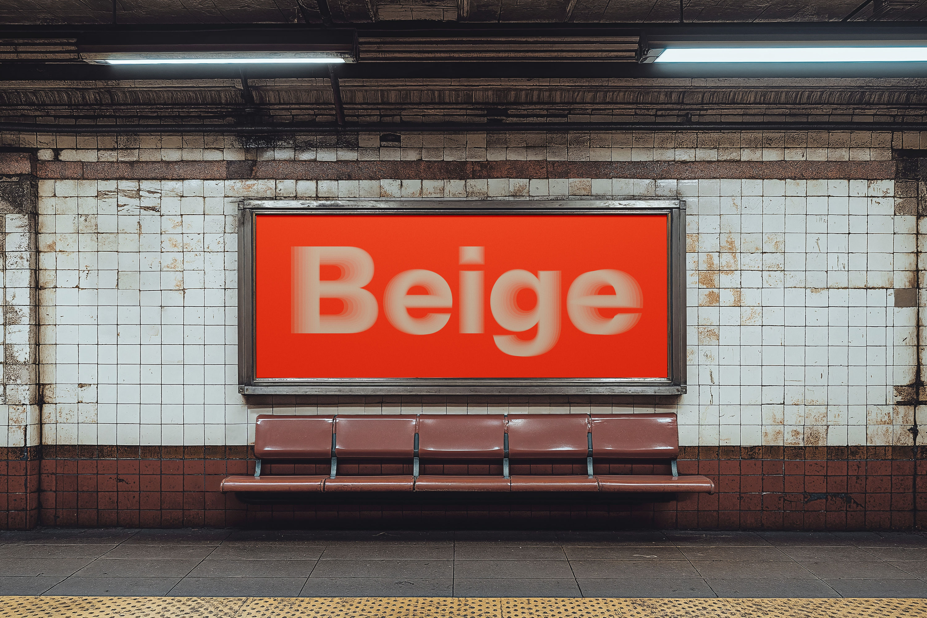
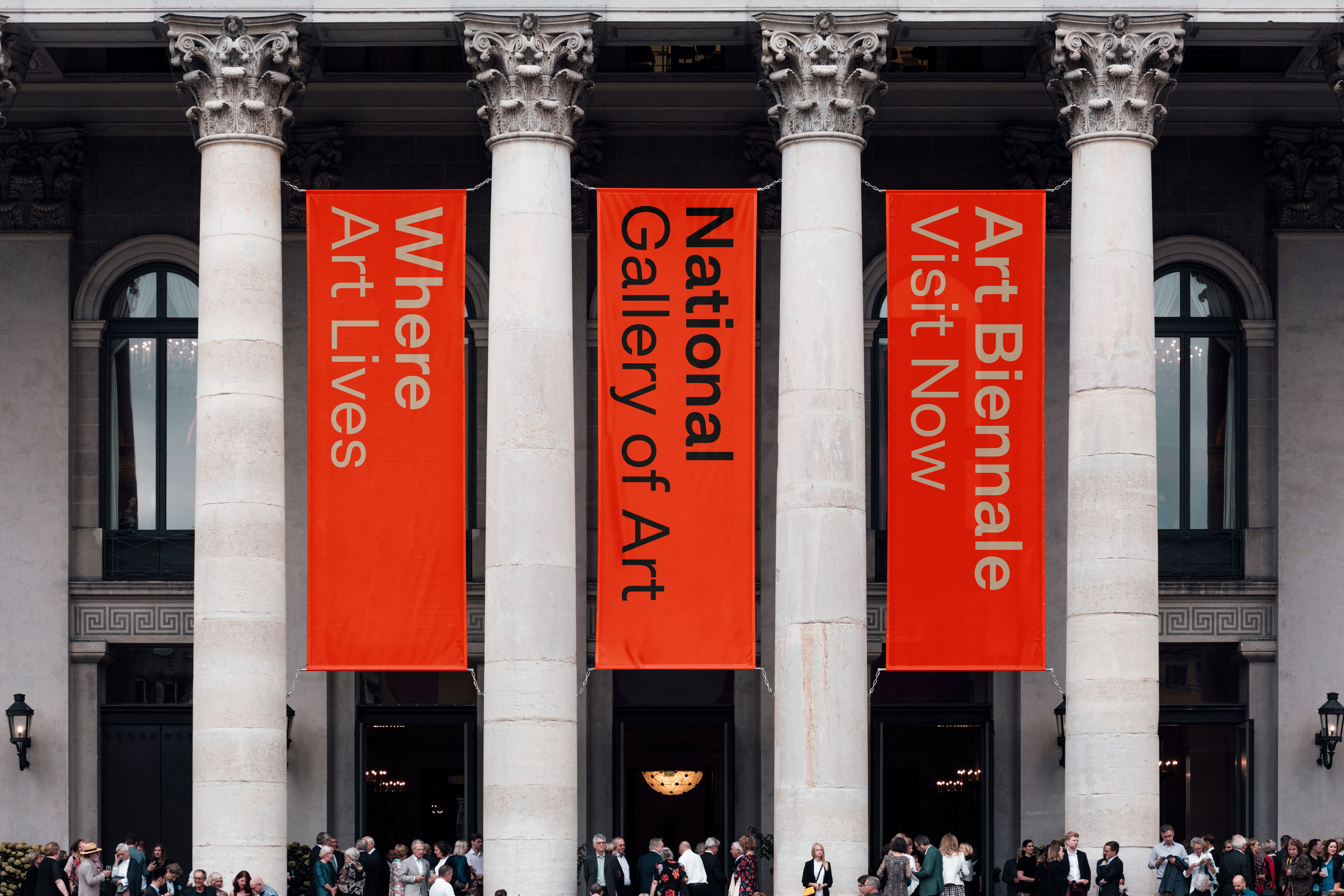
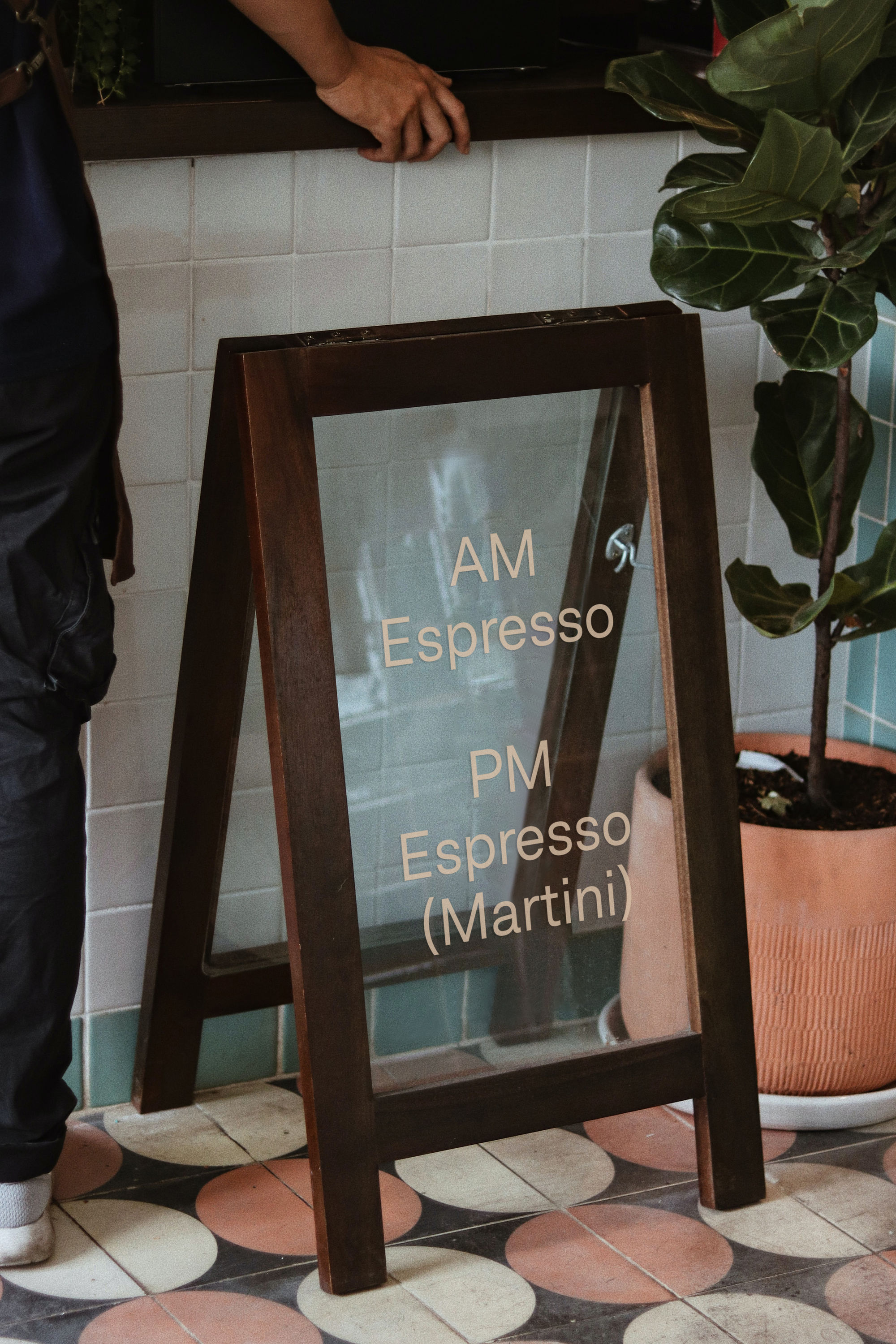
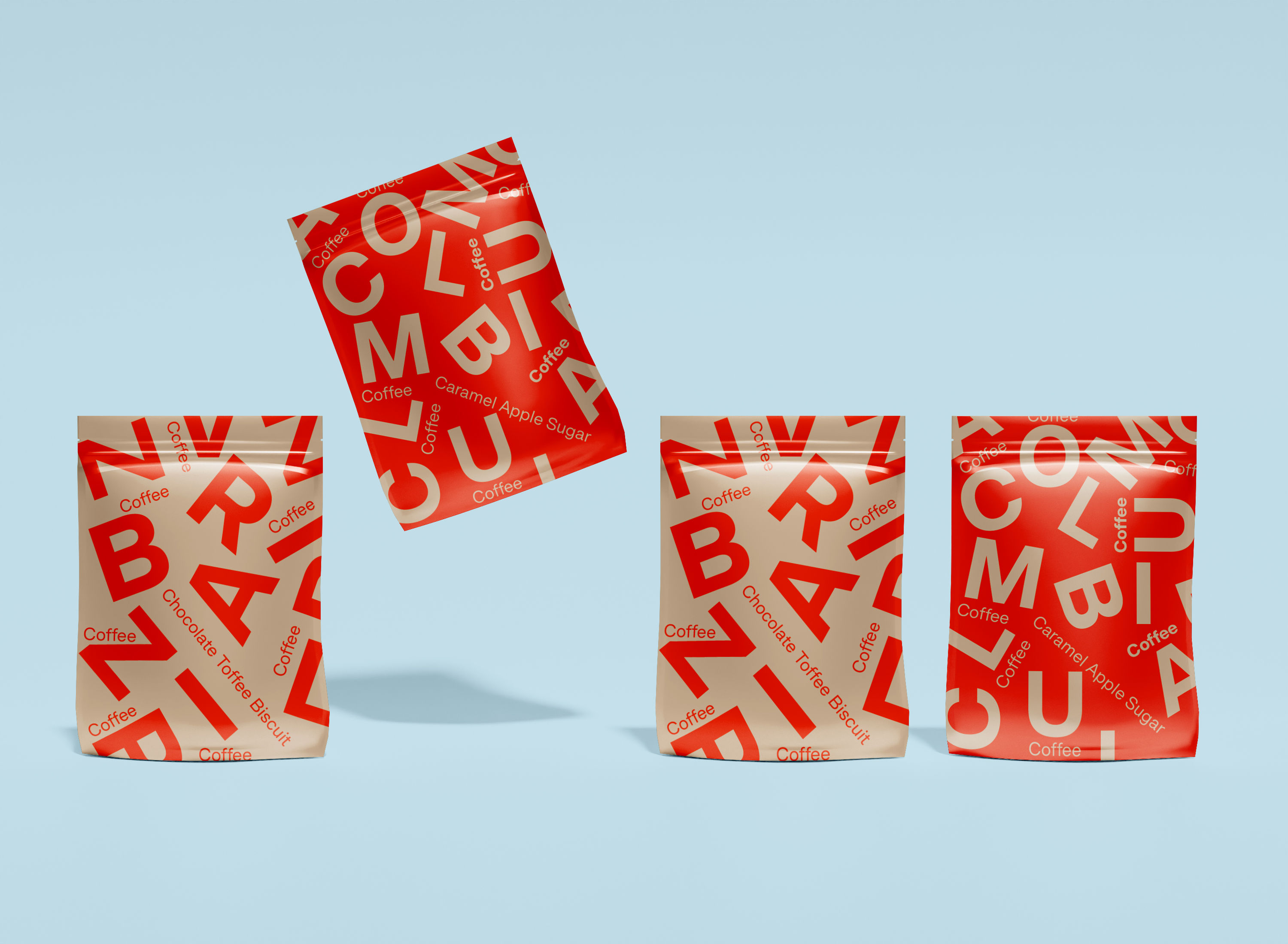
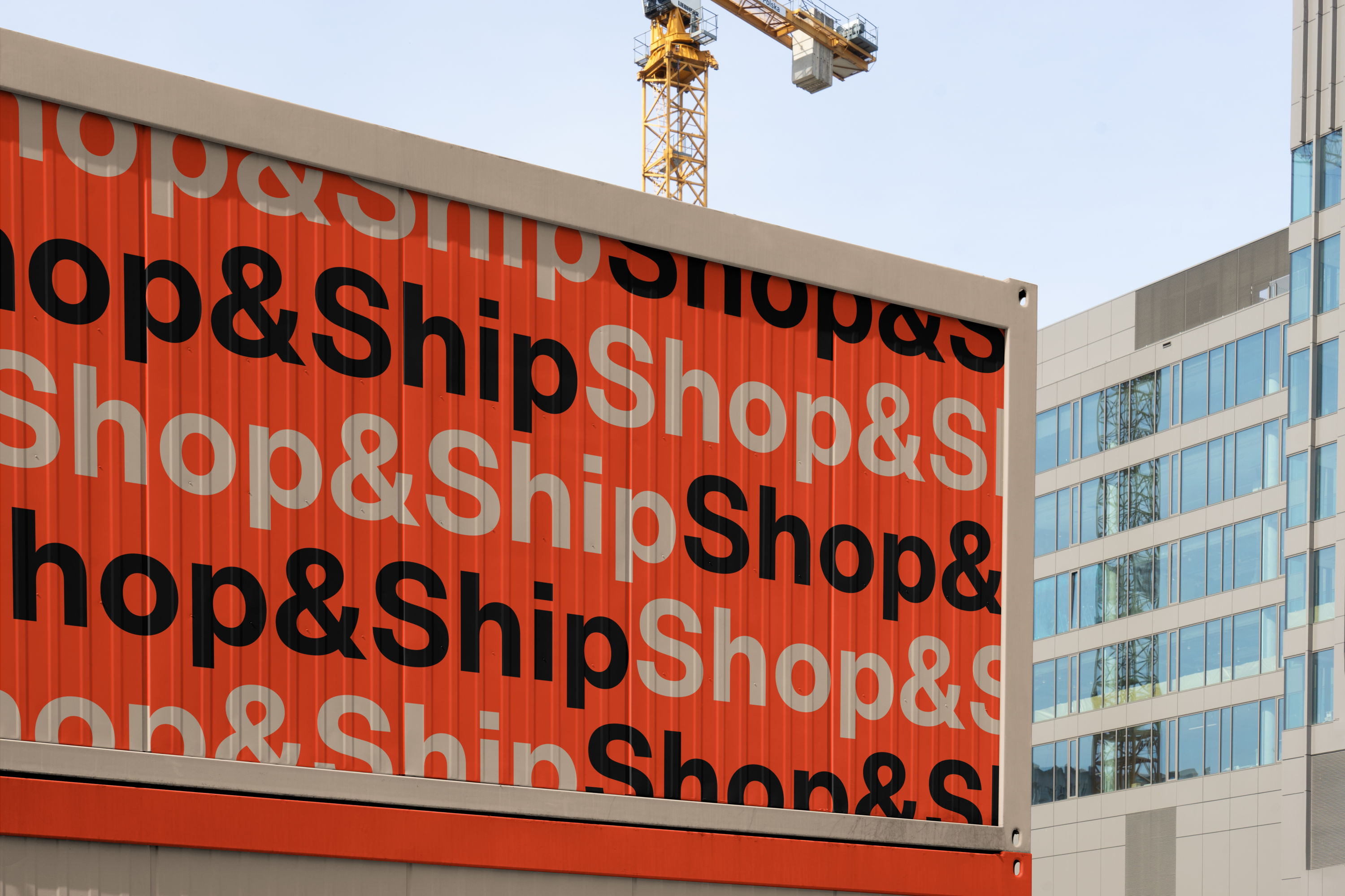
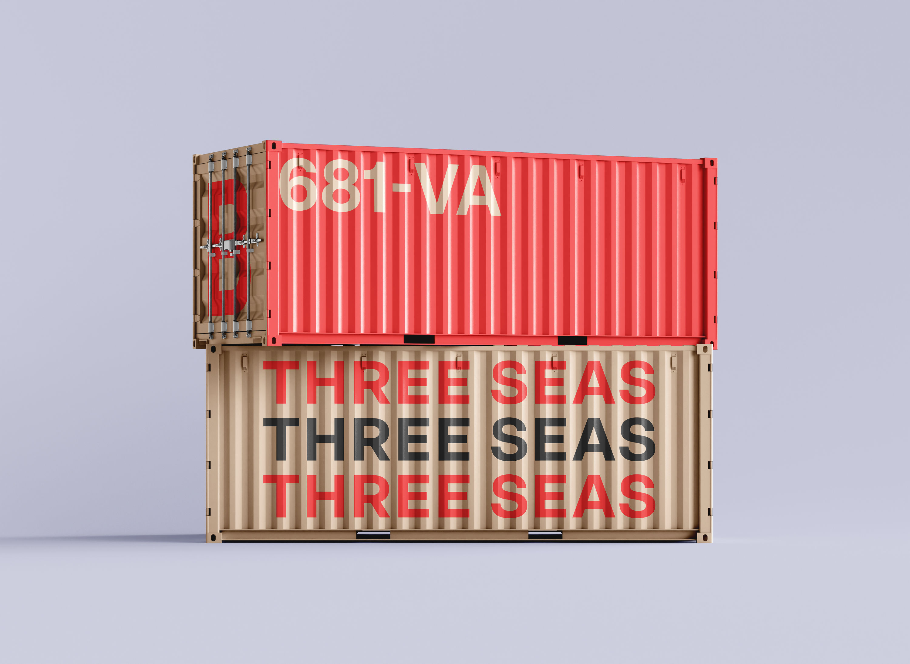
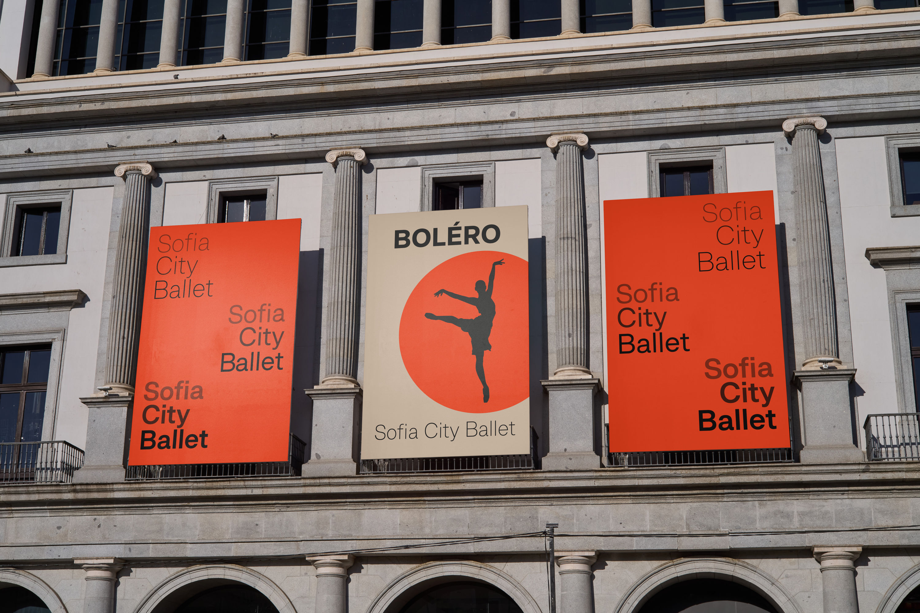
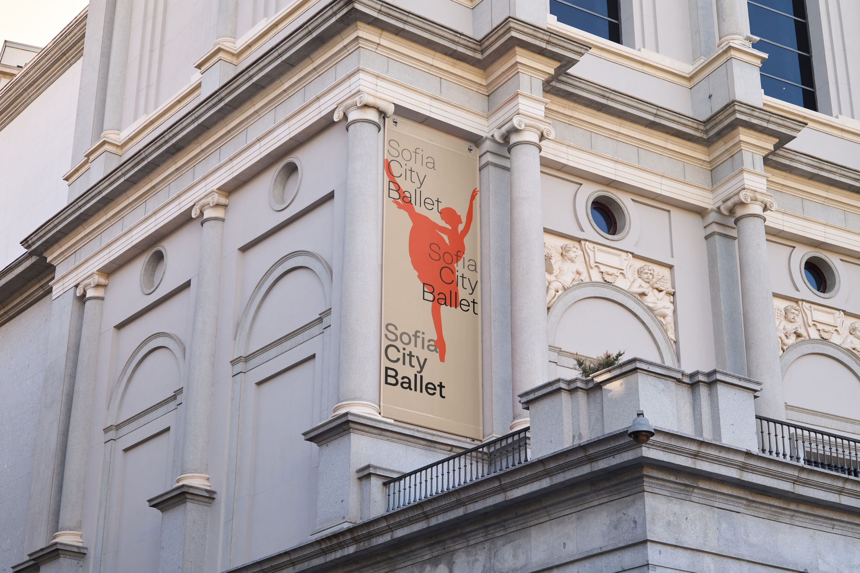
Beige is a modern sans rooted in the tradition of iconic neo-grotesques—reassuringly familiar, clean and legible. The name began is an ironic nod to the visual neutrality so often favoured by designers. But the process of drawing Beige revealed something more essential: the importance of having a dependable, versatile sans that still carries a point of view. Supporting Latin, Extended Cyrillic, and Greek, the family spans ten weights with a matching monospaced variant, making it suitable for complex typographic systems.
What truly defines Beige is its flexibility. Extensive stylistic alternates allow designers to fine-tune the tone, adjusting the typeface’s level of neutrality and expression project by project. It can be calm and restrained, or quietly distinct, or even friendly. Beige is familiar but never generic—a dependable tool designed to adapt. Your version of neutral, shaped by choice.
Overview
Hairline
Thin
Light
Book
Regular
Medium
Bold
Heavy
Black
Ultra
Variable Axes
World!
Specimen
Hairline
Geometric series
Ultra
Εξολοθρευτής
Thin
Bayerische S 3/6
Black
Западен Свят
Light
Washington D.C.
Heavy
Японска Кухня
Ultra
Hairline
Black
Thin
Heavy
Light
Hairline
Medium
Thin
Bold
All about ‘a’
Book
Metal Gear Solid
Bold
Грета Тунберг
Regular
Airbus A330neo
Medium
Τζέιμς Κάμερον
Bold
Book
Medium
Regular
Light
Heavy
Medium
Roman Coppola
Regular
Кендрик Ламар
Bold
Cosmographies
Book
Μπλέιντ Ράνερς
Regular
Medium
Book
Bold
Selected Glyphs
Heavy
Helmut Newton
Light
Стивън Хокинг
Black
Villeroy & Boch
Thin
Санта Барбара
Ultra
Electromagnet
Hairline
Дакота Фанинг
Light
Heavy
Thin
Black
Hairline
Ultra
Book
Black
Regular
Ultra
Stylistic Sets
Default a
Alt a: Swiss style SS01
Default a
Alt a: no tail SS02
Default a
Alt a: single-storey SS03
Default g
Alt g: double-storey SS04
Default G
Alt G: with spur SS05
Default Kk
Alt Kk: diagonals SS06
Default y
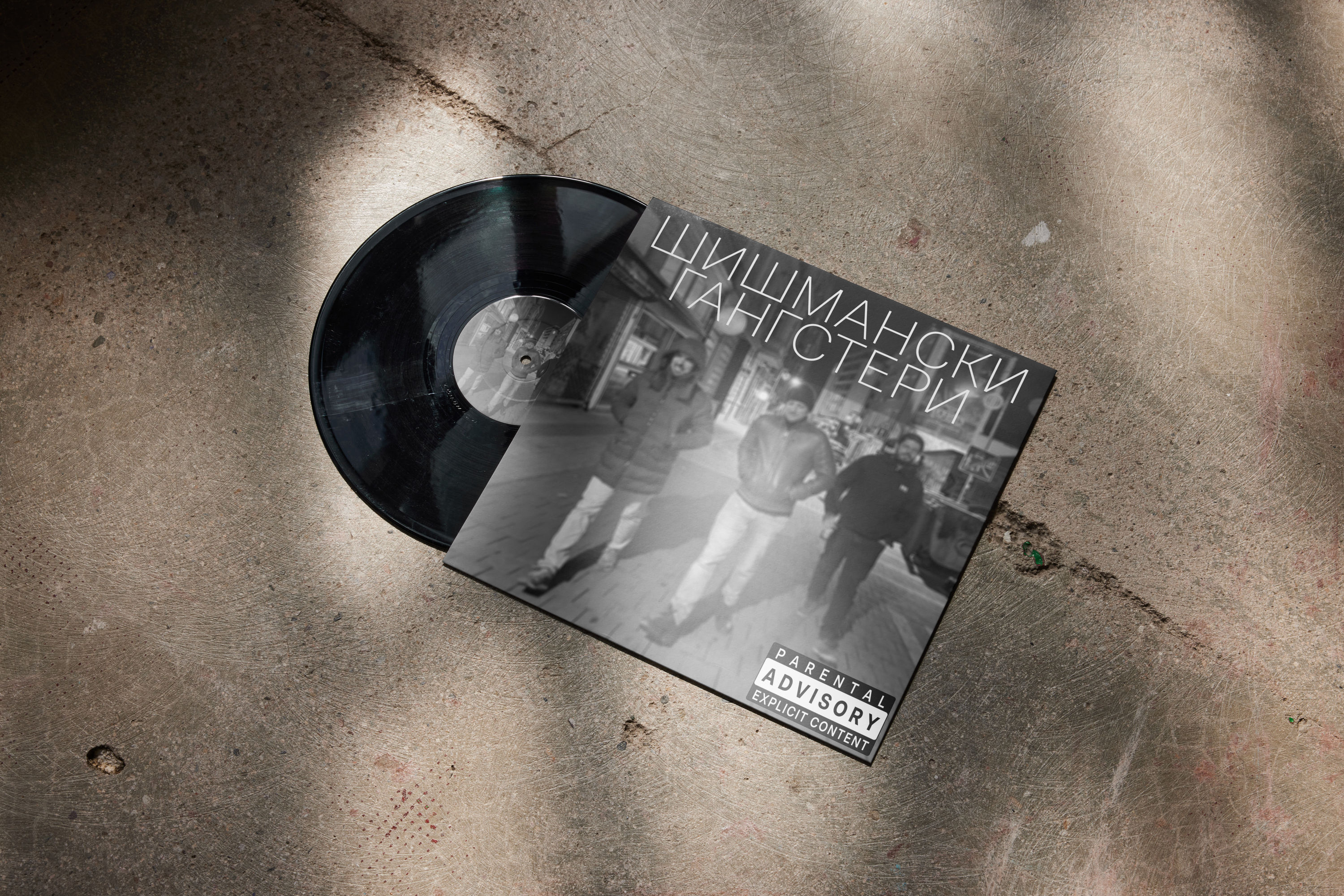
Ултиматум
Alt y: straight tail SS07
Ултиматум
Default I
Alt I: with crossbars SS08
Default l
Alt l: with tail SS09
Default б
Alt б: fancy tail SS10
Default ф
Alt ф: split counter SS11
Default 3
Alt 3: flat top SS12
Default Numbers
Circled Numbers SS13
Default Numbers
Black Circled Numbers SS14
Default dots
Circular dots SS15
Default Cyrillic
Бруталист
Оптимизъм
Вещество
Bulgarian Cyrillic SS16
Бруталист
Оптимизъм
Вещество