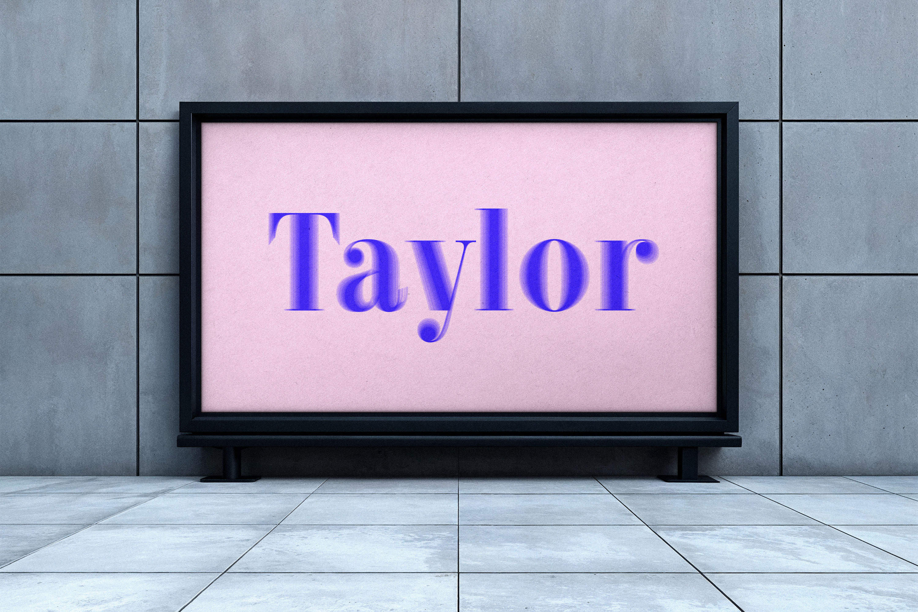
Taylor
About
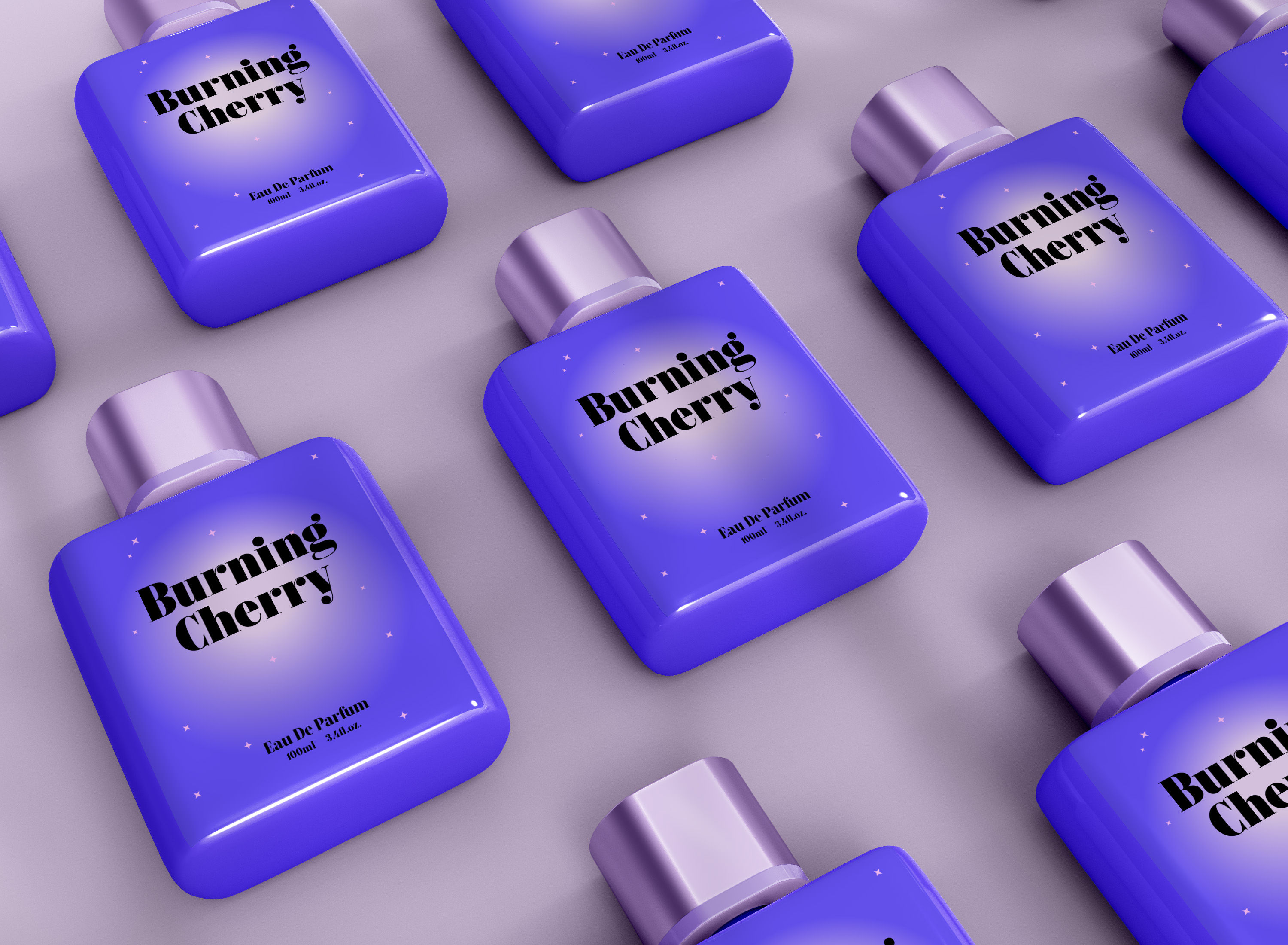
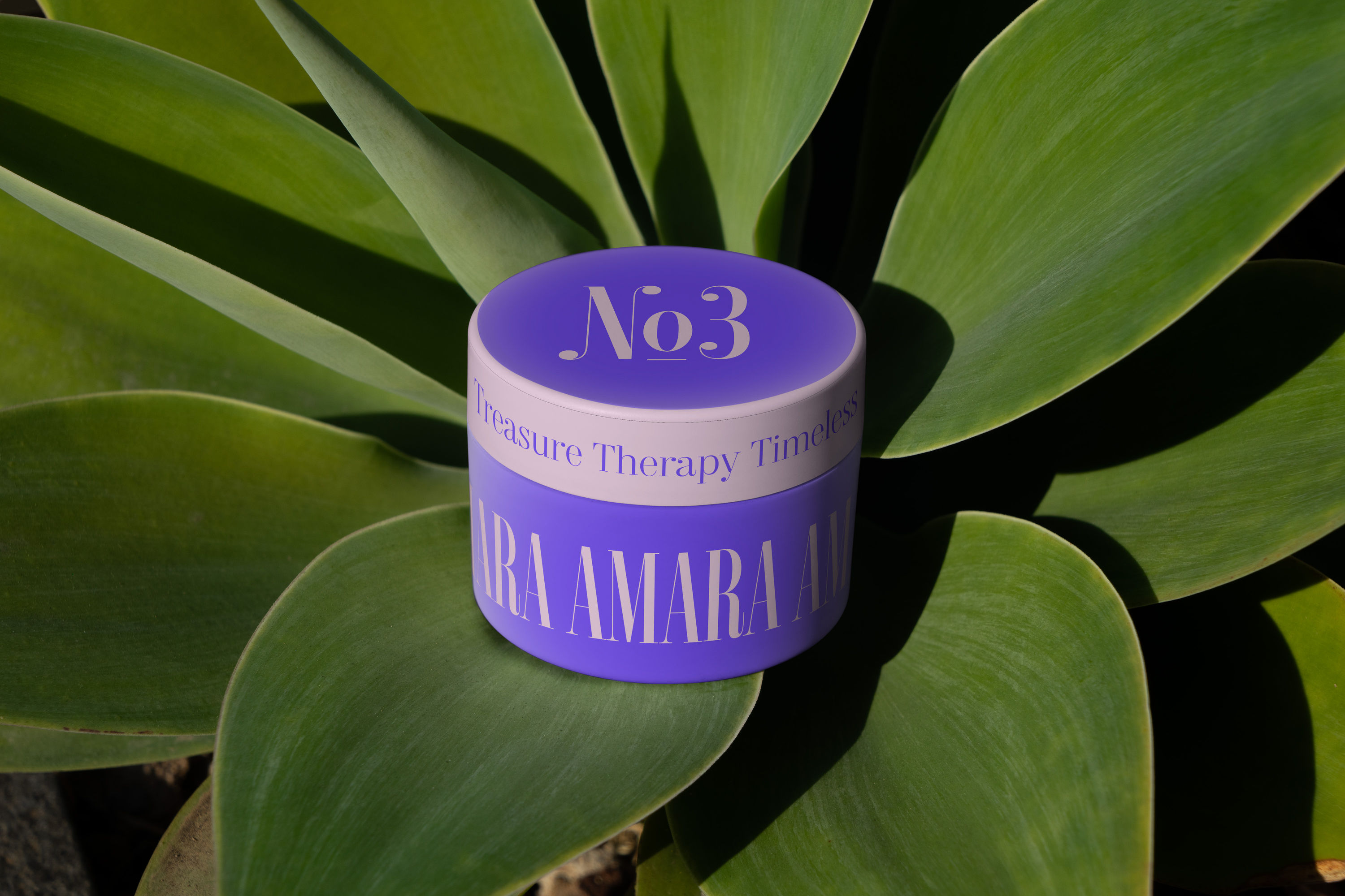
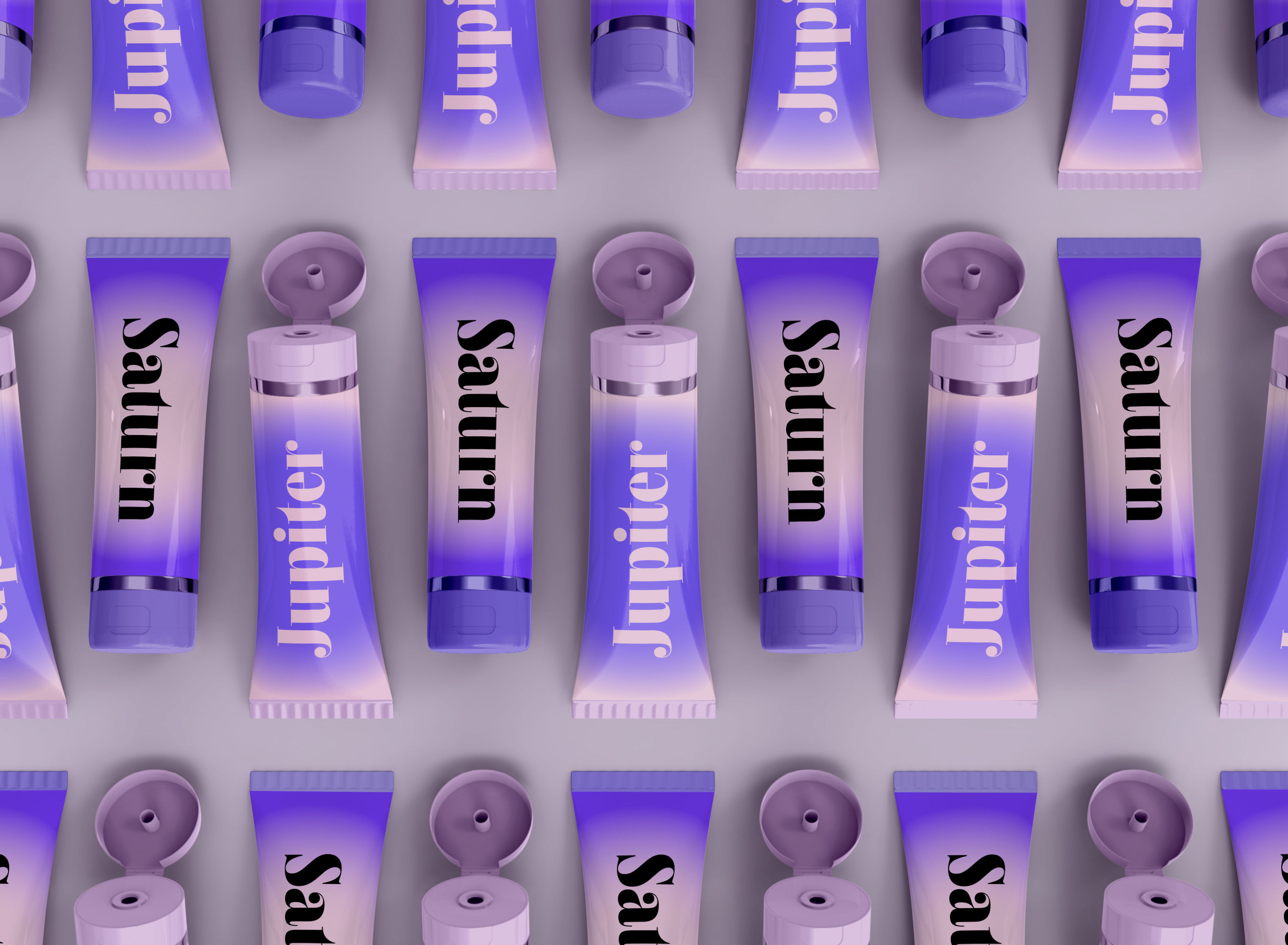
Taylor is a contemporary serif inspired by the dramatic elegance of classical high-contrast typefaces such as Bodoni and Didot, as well as the expressive Fat Faces from the 19th century. Designed unapologetically, Taylor thrives at large sizes, where its striking contrast, sharp forms and refined details can fully blossom.
The family features a range of weights and widths, each declaring its strong, unmistakable character. Taylor remains precise and controlled in all variations: circular terminals persist even in the most Compressed styles, creating a consistent visual rhythm. Delicate hairlines meet heavy verticals with confidence, resulting in a typeface that is both elegant and slightly brutalist in detail.
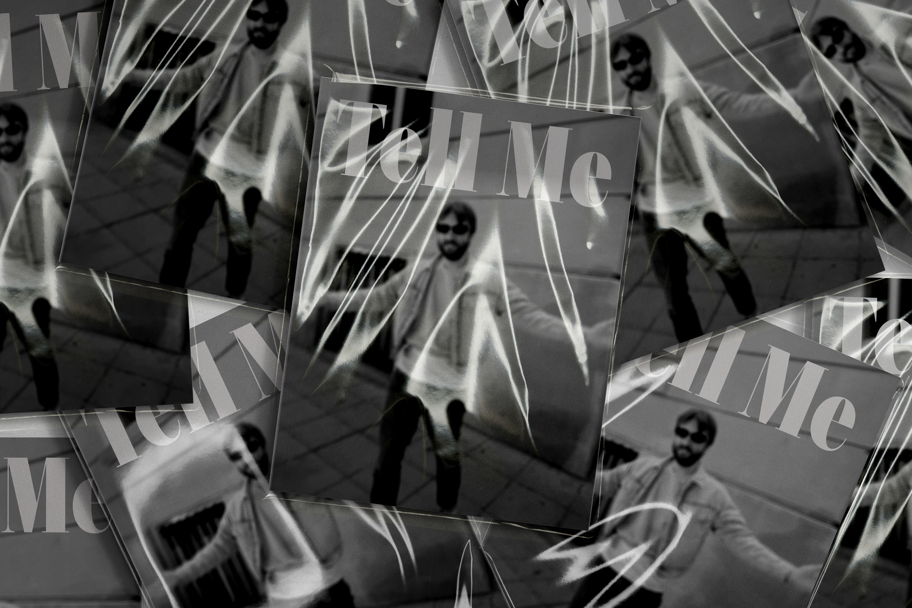
Taylor evokes the language of timeless sophistication—confident, luxurious, and intentional. It is not subtle, but exacting: a typeface designed to command attention with style and authority.
Taylor Standard
Taylor Narrow
Taylor Condensed
Taylor Compressed
Overview
ExtraLight
Regular
Bold
Black
Variable Axes
in Tau-Ceti
Specimen
ExtraLight
Steve McQueen
Black
Нощен Клуб
Light
Eurocopa 1968
ExtraBold
Обади Ми Се
Regular
Moulin Rouge!
Bold
Марк Ротко
Medium
Masters of Sex
SemiBold
Ема Томпсън
SemiBold
Autostrada A1
Medium
Лапис Лазули
Bold
Damien Hirst
Regular
Дрю Баримор
ExtraBold
La Dolce Vita
Light
Джейн Фонда
Black
Ferrari F430
ExtraLight
Палома Фейт
Range
Standard
Black
Narrow
Condensed
Compressed
ExtraBold
Bold
SemiBold
Medium
Regular
Light
ExtraLight
Stylistic Sets
Default Kk
Alt Kk: simplified SS01
Default б
Alt б: simplified SS02
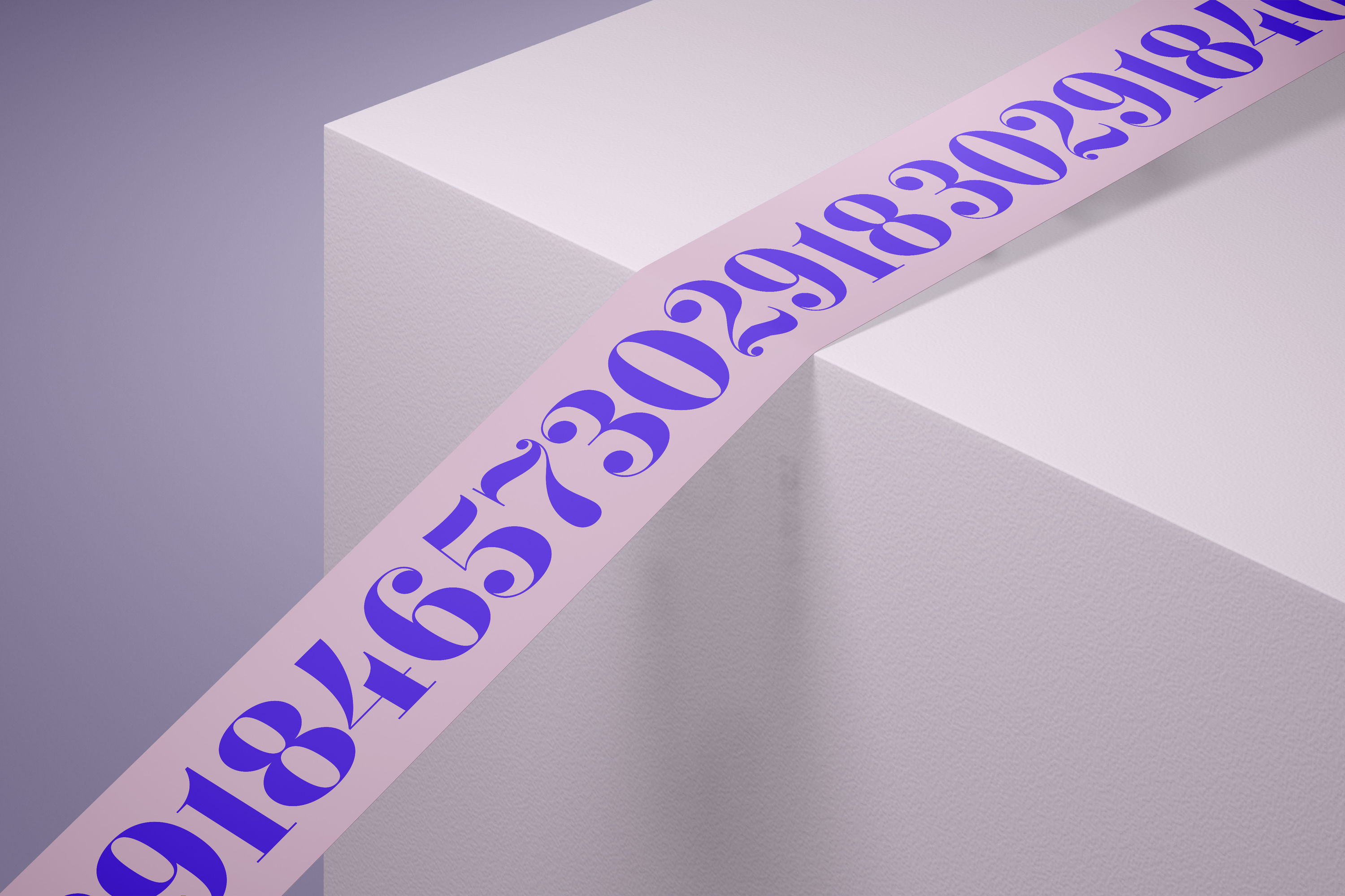
Default Figures
Alt Figures: simplified SS03
Default t
Alt t: funky top SS04
Default bq
дърворезба
Alt bq: sexy curves SS05
дърворезба
Default &
Alt &: fancy SS06
Default Cyrillic
Французойка
Изкуствовед
Bulgarian Cyrillic SS07
Французойка
Изкуствовед
Default Cyrillic
Serbian Cyrillic SS08
Default Д
Alt Д: triangular top SS09
Default Dollar Sign
Alt Dollar Sign: simplified SS10